
Paul Rand was an important graphic designer and art director in the twentieth century. He was the pioneer of iconic corporate logo designs for major firms, including IBM, ABC, Morningstar, Inc., NeXT Computer, Yale University and Enron. He was an avid practitioner of Swiss Style of graphic designing in American advertising industry.
Rand, initially named Peretz Rosenbaum, was born on August 15, 1914, in Brooklyn, New York, Since a very early age, he had shown an interest in painting and designing . Paul attended night classes at the Pratt Institute from 1929 to 1932 and attended several other art schools such as The New School for Design, the Art Students League and Yale University in Connecticut. Although Rand received extensive training in the arts, Rand developed his graphic sense through self-education largely, as he voraciously read the European magazines, discovering the works of Cassandre and László Moholy-Nagy.
Paul rand was greatly responsible for defining visual culture in America as he radically transformed advertising. Rand earned his ultimate success by designing corporate logos. Paul Rand became a house hold name for logo designing in corporate industry. In 1956, IBM became one of the companies that truly defined rand’s identity and put him on the map. He revised the IBM logo design in 1960 and yet again in 1972 with the famous stripes pattern. Other evidence of Rand’s graphic genius is seen in NeXT Computer corporate identity project, ABC, UPS AND ERON.
I believe rand is of the most successful, influential and revolutionary graphic designers of all time. He has mastered the technique of simplicity in design as he manages to make striking and effective designs by using the most basic components and strategically arranging them with a modern approach. With the purpose that graphic design serves, it calls for design to be recognizable and easily understood which I think rand has done expertly by making these iconic brands who they are today.
Steve Jobs admired Rand’s graphic creativity and called him “the greatest living graphic designer.”
Paul Rand said, “Visual communications of any kind, whether persuasive or informative, from billboards to birth announcements, should be seen as the embodiment of form and function: the integration of the beautiful and the useful.” It’s not only about how it looks, or how it works, but about how it looks and works together.
RAND’S WORK:
This slideshow requires JavaScript.
INSPIRED WORK:
This slideshow requires JavaScript.
References:
Paul Rand – http://www.famousgraphicdesigners.org/paul-rand
Paul Rand, the Visionary Who Showed Us That Design Matters – http://www.wired.com/2015/04/paul-rand-visionary-showed-us-design-matters/
The Influence of Paul Rand’s Thoughts on Design – http://justcreative.com/2014/08/15/the-influence-of-paul-rands-thoughts-on-design/

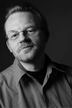 Jonathan Hoefler is an American Typeface designer, born August 22, 1970. He was educated at the Rhode Island School of design and founded The Hoefler Type Foundry in 1989 in New York. In 1999 Hoefler began working with a type designer by the name of Tobias Frere-Jones, and their company adopted the name Hoefler & Frere-Jones. However, after about 11 years of partnership, they decided to split.
 Deconsructivism began to develop in the late twentieth century, being a continuation of post-modern architecture. Designers disturbed the ordinary space and basic characteristics of traditional buildings such as the body or shape of the building and frame construction. Modifications such as curving , waving or breaking walls is done. By doing this, buildings are seen as stimulating unpredictability and controlled chaos.


 Die Stijl was founded in 1917. The artists most recognized with the movement were the painters Theo van Doesburg, who was also a writer and a critic, and Piet Mondrian, along with the architect Gerrit Reitveld. The movement proposed ultimate simplicity and abstraction through which they could express.
 Pop art is an movement that emerged in the mid-1950s in Britain and the late 1950s in the United States. Pop art presented a challenge to traditions of fine art by including imagery from popular culture such as advertising and news. In pop art, material is sometimes visually removed from its known context and is isolated and/or combined with unrelated material. Pop art employs aspects of mass culture, such as advertising and comic books
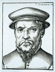 Claude Garamond was Born in Paris, France in 1490, Garamond started his career out as an apprentice for the Parisian punch-cutter and printer, Antoine Augereau in 1510 . In the 16th century that Garamond and his peers found that the typography industry was something of interest. .Many of the printers during that time period were able to master all or most of the artistic and technical skills of book production from type design to bookbinding. Claude Garamond was first to specialize in type design, punch cutting, and type-founding in Paris as a service to many famous publishers.


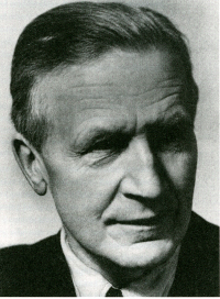 Paul Renner was a well known German graphic designer, type designer and typographer in the 20th century. He was also known for being an eminent author, painter and teacher. Renner was born on August 9th, 1878 in Wernigerode, Germany.